That’s not an easy question.
In the UK there’s income tax, and national insurance – both shown on our wage slip. But also employer’s national insurance – which the employer pays, and isn’t visible on our wage slip, but evidence suggests is mostly borne by workers (i.e. because the employer has an amount they’re willing/able to pay as wages, and employer NICs come out of that).
Take all that together, and of the average UK wage of £37k, the total tax (sometimes called the “tax wedge”) is 22%. This is the “effective tax rate”, not to be confused with the “marginal tax rate”, for which see here.
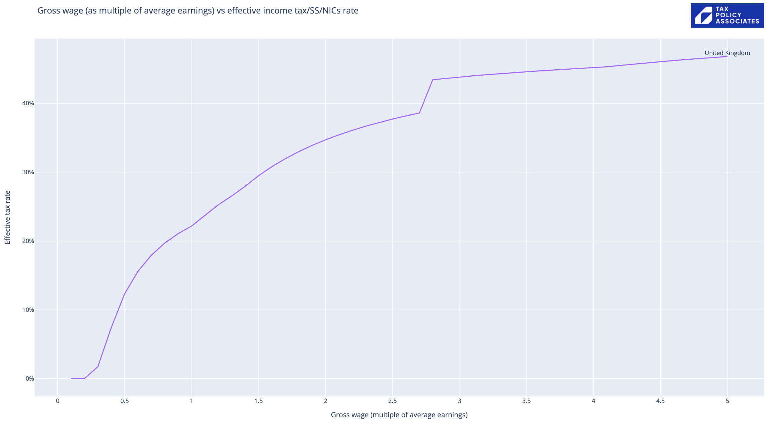
How does the rate change as incomes increase? The chart at the top of this post looks at income vs tax wedge, measuring income as a multiple of the average wage (thanks to a little bit of python). Caveats below.
Obvious points: looks like a nicely progressive upwards curve until we hit £100k, at which point the personal allowance starts to be withdrawn and the curve kinks upwards way too steeply. Then eventually the curve trends towards the eventual marginal rate of 47% (45% income tax plus 2% national insurance).
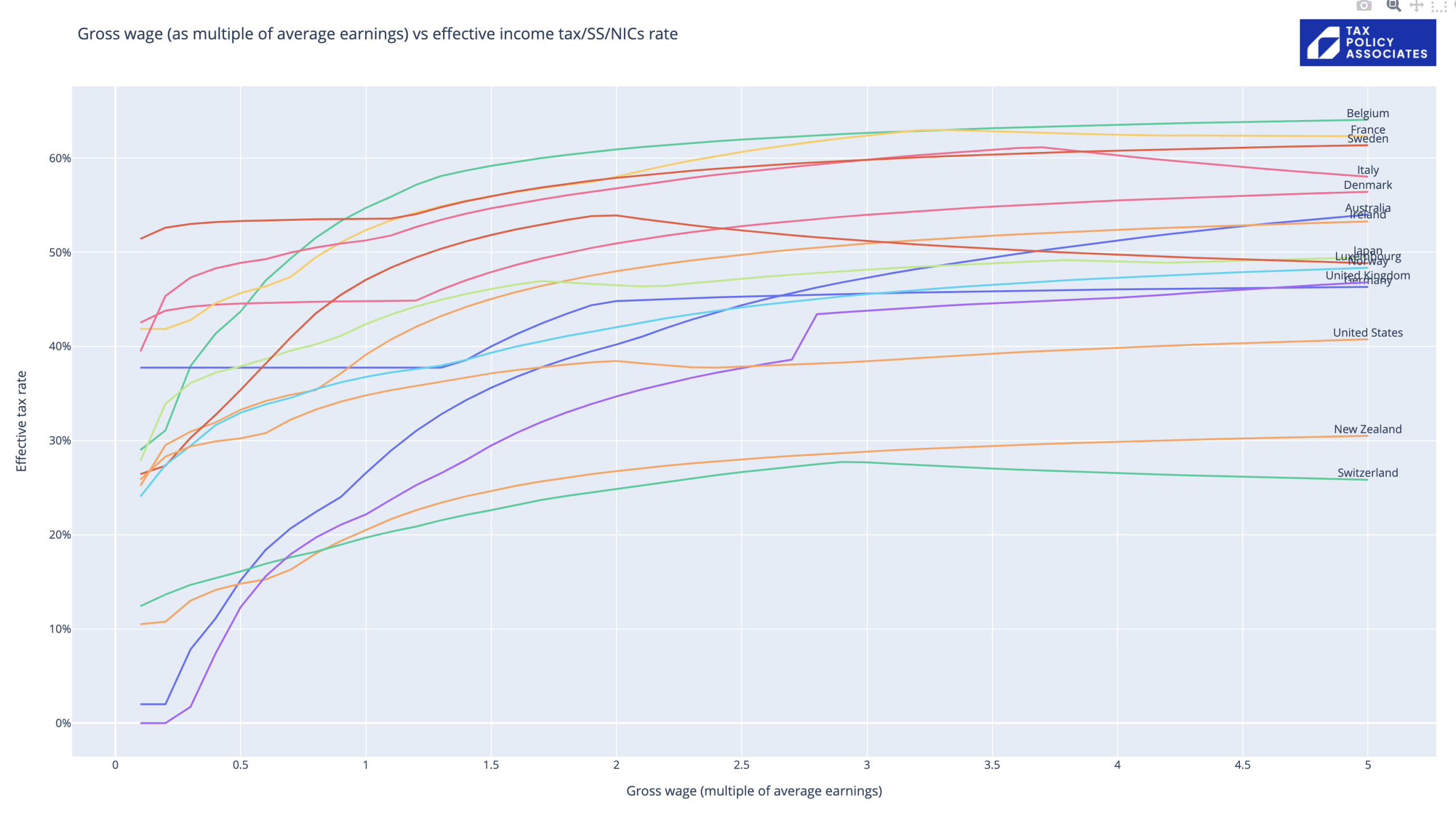
How does this compare with other countries? Thanks to the wonderful OECD tax database and that bit of python, we can say it looks like this: (caveats caveats caveats below).

Obvious conclusion: until you get to quite high incomes (almost twice average) the UK taxes income less than any comparable country, with only a few small countries/tax havens taxing less. I haven’t cherry-picked the comparisons here – if you click on the chart you can play around, clicking on different countries to hide/reveal them.
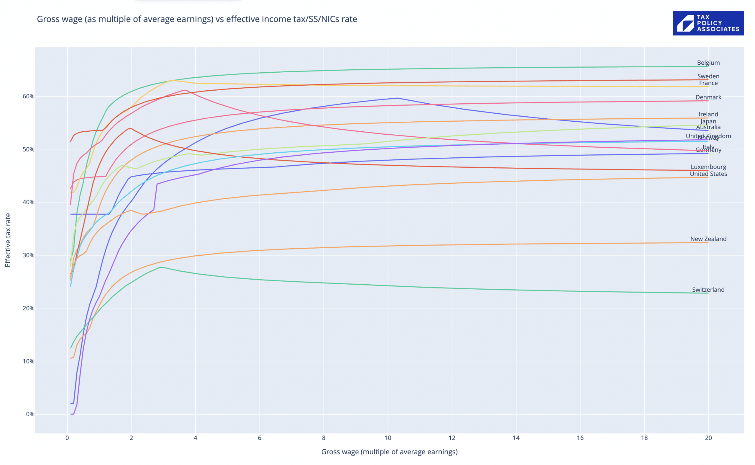
What about high earners? That’s clearer if we re-run the code to go up to 20x average incomes (which in the UK equates to about the top 1% of earners):

The UK (purple line again) tracks lower than most of Europe, but (surprisingly) shows a higher effective rate of tax on high incomes than Germany or Spain. Way less than Belgium, France, Sweden.
There are political conclusions from both charts I will blog about another time.
Now the extensive, but probably incomplete, list of caveats:
- All data is for 2020, the latest available from the OECD. UK national insurance has of course gone up since.
- The code and underlying spreadsheet are “quick and dirty” and there are almost certainly mistakes and omissions. Please don’t use this for anything serious without checking carefully, ideally going to local experts to verify the data and assumptions. With a bit of work this could be a robust and useful project; it’s not there now.
- The underlying data comes from the OECD tax database, and the average earnings figures from the OECD labour/wages database. Adapted in places (e.g. the Belgian local income tax figures reflect the revenue position for the Belgian local authority and not the position for taxpayers). I added the withdrawal of the UK personal allowance, because it is so significant; there may be similar issues in other countries which I have missed. All errors are mine.
- The data takes into account employer and employee social security/national insurance, and national and state/local income taxes (at the national average). No other taxes.
- The data completely ignores the benefits system. That has two big consequences. First, it means the apparently high effective rates on low incomes in many countries are misleading, because we’re missing the other half of the picture. Second, where benefits are means tested, there is often a high marginal rate at the point they’re withdrawn.
- The data excludes mandatory pension contributions.
- The data ignores deductions/reliefs (with the exception of universal allowances/credits). That doesn’t matter much for countries like the UK, where reliefs for employees are very limited; but it makes the US data unreliable given the very generous deductions/reliefs permitted in the US.
- Where countries have different rates for different family types, the rates/allowances used are for wage income of a single person without dependants. This will somewhat affect the effective rate for someone on a lower income, but will have little effect on higher incomes.
- The code assumes that local taxes use the national tax base (after personal allowance/credits) and national insurance/social security exclude all personal allowances/credits. That won’t always be right, and will cause errors for (in particular) lower incomes.
- The fact VAT isn’t included has the overall effect of flattering every country except the US (i.e. because they’re the only major economy with no VAT).
- Private medical insurance isn’t included. That has the overall effect of flattering the US figures (because we’re not comparing like with like). Possibly this and the VAT effect cancel out. Or possibly they don’t. Someone could do the math!
- Property taxes aren’t included. That’s significant for countries like the UK where local authorities are funded by property taxes not local income taxes. So the chart is somewhat flattering the UK (particularly at middle incomes where there is no council tax relief, but the council tax bill could be 10% or more of a household’s total tax bill).


10 responses to “How much tax do we actually pay on our wages?”
Hi Dan
Very interesting. I’m wondering about the UK earnings figures: according to UK government (HMRC) statistics (here: https://www.gov.uk/government/statistics/percentile-points-from-1-to-99-for-total-income-before-and-after-tax) median annual income in 2019/20 was £26k, with the “1%” starting at £180k (ie only 6.9x median).
Do you know why there’s a discrepancy?
Also, would be interesting to hear your thoughts on the interaction of the loss of personal allowance with other tax rules (an example is the taxation of buy-to-let income without deductibility of mortgage interest, potentially leading to marginal rates over 100%); are there other examples?
Hi Stefan – I believe that’s the difference between average income (including e.g. pensioners) and average wages. The figures I used were for wages (as that’s what my calculations cover), and the source is https://stats.oecd.org/viewhtml.aspx?datasetcode=AV_AN_WAGE&lang=en
Someone should compile a complete list of the various tax oddly high marginal rates the UK system can create. Given the withdrawal of the annual allowance, plus the pensions contribution limit and pensions cap, and loss of child benefit, it wouldn’t surprise me if it approaches 100% even ignoring buy-to-let income.
A good comparison. A couple of points to add in respect of the US comparative elements: 1. US local authorities also have property taxes that are significantly higher than the UK in addition to income taxes and sales tax; 2. You mention VAT as a benefit to the US as it doesn’t have it, but the US does have sales tax which can be as high as 15% in some local areas; 3. Health insurance is a HUGE impact and my view has always been to include it as a tax because if you don’t buy a policy in the US you have to pay a tax penalty, but buying a policy makes it a better comparable to countries that operate taxpayer health systems.
Another point to add for systems that tax on a family basis. You state that the top rates for higher earners won’t change much, but in the system in France in particular, if you have 3 children the impact is incredibly significant in pulling down your marginal rate band as the bands are effectively multiplied in size by the number of family members. Consequently you can be very highly paid but be sitting in a very low rate tax band.
Interesting! Are there any reliable sources for how those French rules work? Would be fascinating to see how the ETR changes.
Close to home, Swiss rates seem wrong. Marginal income tax rate depends on your Gemeinde but should be roughly 37-42%, plus AHV on top*, so I don’t understand why the line trends down below 30% after 3x average earnings. Even allowing for progression so less tax on the first part of the income, it ought to slope up not down.
*E.g. Marginal rate in ZH city: Fed tax 11.5% Zurich Kanton max rate 13% Gemeinde rate 134% of Kanton, so , say 11.5% + 13% + 134%x13 % + 5.3% AHV = 47.2%
it does seem strange. The OECD database (https://stats.oecd.org/index.aspx?DataSetCode=TABLE_I1) has the Swiss marginal rate dropping from 13.2% to 11.5%, which is why the effective rate in my chart heads downwards. A mistake in the database?
Hi Dan, very interesting. What happens in the UK between the multipliers of 2.7 and 2.8. The ETR jumps significantly. suggesting some sort of taper failure.
yes, that’s the brilliantly designed tapering-off of the personal allowance, which results in marginal tax rates of over 60% at salaries over £100k…
Hello Dan. I think that the NIC rates have gone up by 1.25% from 6 April 2022 (so 3.25% rather than 2%). Feel free to delete this comment.
thank you! I should have been clear: the data comes from 2020 and so doesn’t reflect the NIC increase. That’s as recent as the OECD stats get, unfortunately…